
The CSS calc() function is a vital part of many responsive websites these days. It allows developers to have the benefits of both absolute units and percentages in CSS positioning. Things that can seem daunting, such as aligning elements equidistant from each other in any given browser width, are made simple with this pain-relieving function.
Here is a demo of the problem mentioned earlier, aligning elements inside of a rectangular parent div. We are going to use 4 child elements in this case.
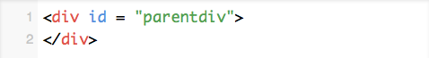
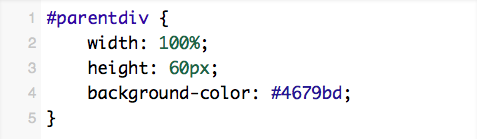
To start, create a parent div element then set it’s width to 100%, height to 60 pixels, and background color to #4679bd.
HTML:
CSS:
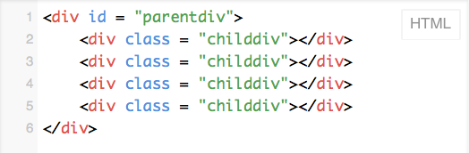
Next, append four new <div></div> elements to the existing #parentdiv. Give each one a class of “childdiv”.
HTML:
Great, almost done. Now its time to use the calc() function! Open up your CSS file and add in the following:
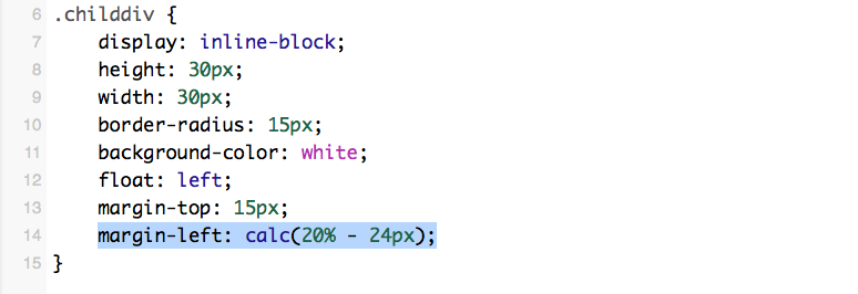
We used the calc function to determine the spacing between each element. The 20% – 24px numbers were determined by imagining the output like this:
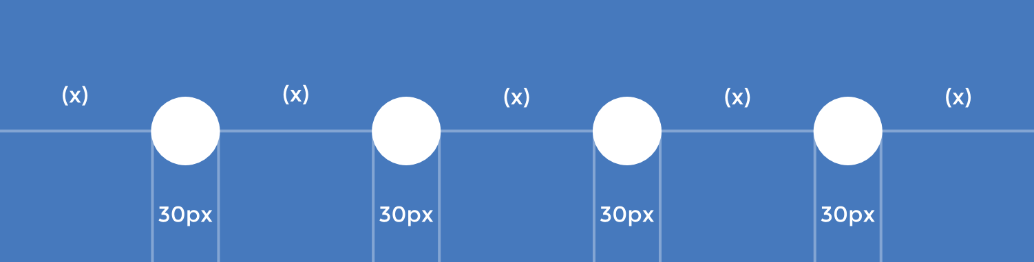
That demonstration shows that calc(100% – Ypx)/(Z + 1) = X where “X” is our result, “Y” is the total width of our elements, and “Z” is the # of elements . In this case “X” would be equal to (20% – 24px).
View the result and code at https://jsfiddle.net/MorganMeliment/La9su80z/
Now, this example only showed elements with equal sizes, but it also works with elements with irregular sizes as well. Just remember to fill out the formula again with the new total width of your elements. Here is an example of that: