(if you haven’t already, make sure that you read Part I first!)
We’ve already covered how to create some basic shapes using CSS (circle, square, triangle, etc), but now it’s time to make shapes that are just a little more complex.
Let’s start with the five-pointed star. Like with all the other shapes we created in part one, we’re going to start with an empty div. For this example, we’ve simply given the div the class “star.” Your HTML should look like this:
<div class="star"></div>
And your CSS should be as follows:
.star {
 margin: 100px 0;
 position: relative;
 display: block;
 color: red;
 width: 0px;
 height: 0px;
 border-right: 100px solid transparent;
 border-bottom: 70px solid #ffc100;
 border-left: 100px solid transparent;
 -moz-transform: rotate(35deg);
 -webkit-transform: rotate(35deg);
 -ms-transform: rotate(35deg);
 -o-transform: rotate(35deg);
}
.star:before {
 border-bottom: 80px solid #ffc100;
 border-left: 30px solid transparent;
 border-right: 30px solid transparent;
 position: absolute;
 height: 0;
 width: 0;
 top: -45px;
 left: -65px;
 display: block;
 content: '';
 -webkit-transform: rotate(-35deg);
 -moz-transform: rotate(-35deg);
 -ms-transform: rotate(-35deg);
 -o-transform: rotate(-35deg);
}
.star:after {
 position: absolute;
 display: block;
 color: red;
 top: 3px;
 left: -105px;
 width: 0px;
 height: 0px;
 border-right: 100px solid transparent;
 border-bottom: 70px solid #ffc100;
 border-left: 100px solid transparent;
 -webkit-transform: rotate(-70deg);
 -moz-transform: rotate(-70deg);
 -ms-transform: rotate(-70deg);
 -o-transform: rotate(-70deg);
 content: '';
}
Your final product should look like this:

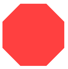
To make things a little more complicated, next let’s make an octagon. Let’s give the octagon a class of “stop-sign,” because most stop signs are octagons.
<div class”stop-sign”></div>
Your CSS should look like this:
.stop-sign {
 width: 100px;
 height: 100px;
 background: #ff4040;
 position: relative;
}
.stop-sign:before {
 content: "";
 position: absolute;
 top: 0;
 left: 0;
 border-bottom: 29px solid #ff4040;
 border-left: 29px solid #fff;
 border-right: 29px solid #fff;
 width: 42px;
 height: 0;
}
.stop-sign:after {
 content: "";
 position: absolute;
 bottom: 0;
 left: 0;
 border-top: 29px solid #ff4040;
 border-left: 29px solid #fff;
 border-right: 29px solid #fff;
 width: 42px;
 height: 0;
}
You might notice that we don’t use transparent color for the border-left and border-rights like we have when making previous shapes. If we use transparent here instead of a color, the negative space that creates the octagon shape won’t appear, and your shape will just look like a red square. If you want the octagon to blend in with the rest of your page, then make sure that the border-left and border-right colors match the background color of your page.
Your hexagon should look like this:
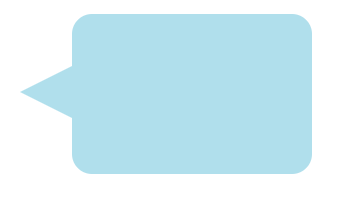
The last shape we’ll make is a cartoon-inspired chat bubble. The class for this shape is going to be “chat.”
<div class="chat"></div>
Your CSS should look like this:
.chat {
 width: 120px;
 height: 80px;
 background: #B0DFEC;
 position: relative;
 -moz-border-radius: 10px;
 -webkit-border-radius: 10px;
 border-radius: 10px;
}
.chat:before {
 content:"";
 position: absolute;
 right: 100%;
 top: 26px;
 width: 0;
 height: 0;
 border-top: 13px solid transparent;
 border-right: 26px solid #B0DFEC;
 border-bottom: 13px solid transparent;
}
Which will render you a shape that looks like this: